
We helped connect students to their future, knowing that an artistic career is more than just a straight line from A to B.
The Joseph Meyerhoff Career Development Center is a vital asset to the MICA community, linking students, alumni, and employers worldwide. Despite being such a valuable resource, the Center’s new office wasn’t easy to find on campus. Printed and digital materials lacked consistency and needed its own identity that worked within the school’s established look while standing out enough to raise its profile on and off campus.
Adaptable Identity
Reflecting the creative spirit and entrepreneurship of MICA’s students and graduates, our graphic identity for the Center uses a flexible visual system that lends itself to multiple logos and a wide range of applications.

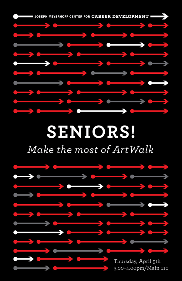
Originating from a simple dot (in reference to the MICA identity), a dynamic line follows a unique path, representing students’ journey and the connections made along the way.
The purposeful path of an artist
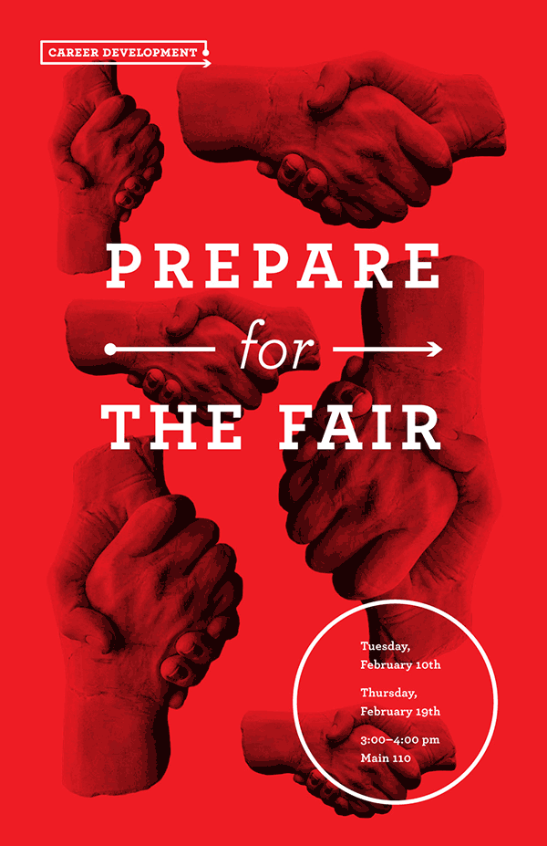
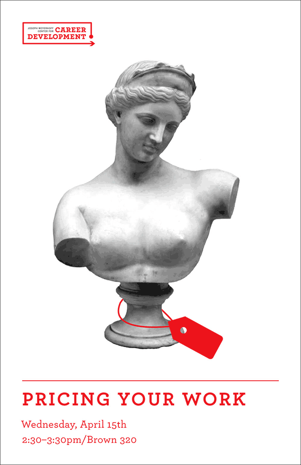
We created a set of icons made of the dot, line, and arrow that relate to the programming and resources of the Career Development office. These are used in materials for dozens of events every year and new ones can be created as their needs evolve.
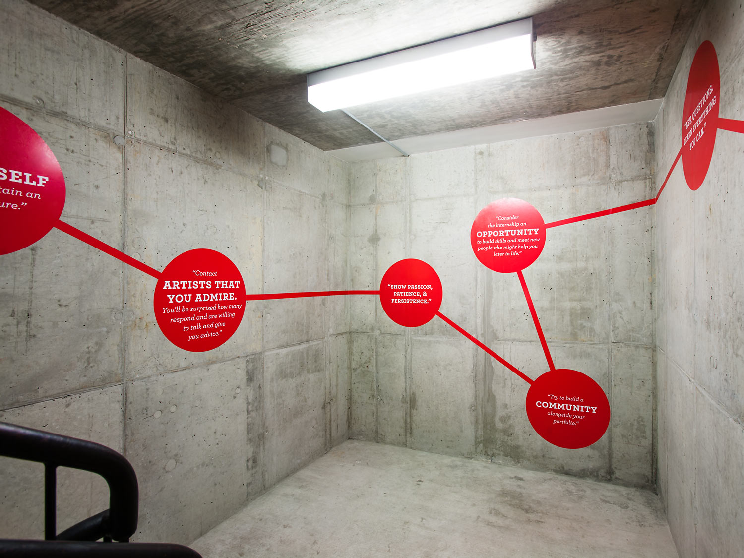
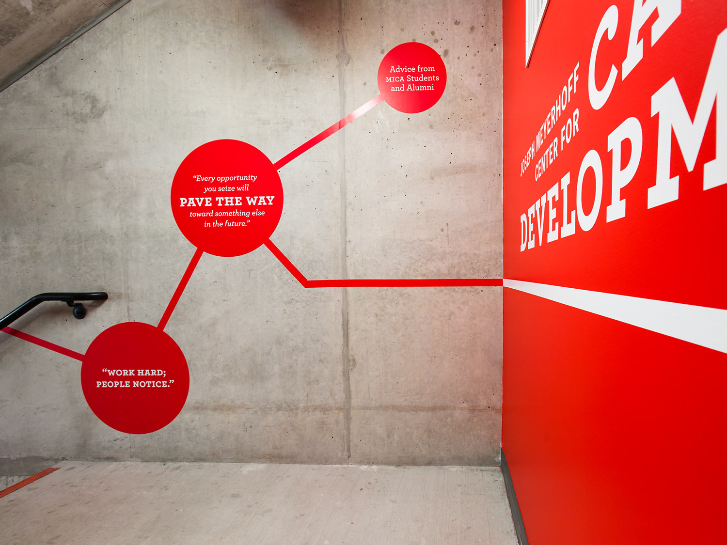
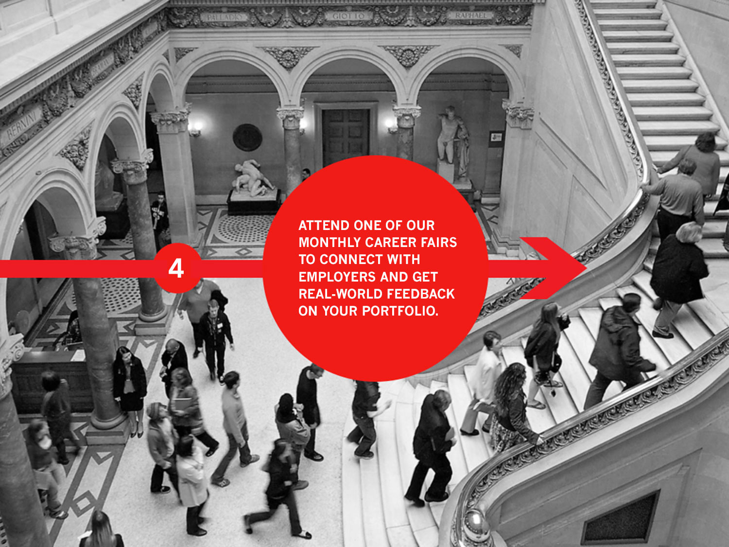
Reviving a gray corridor
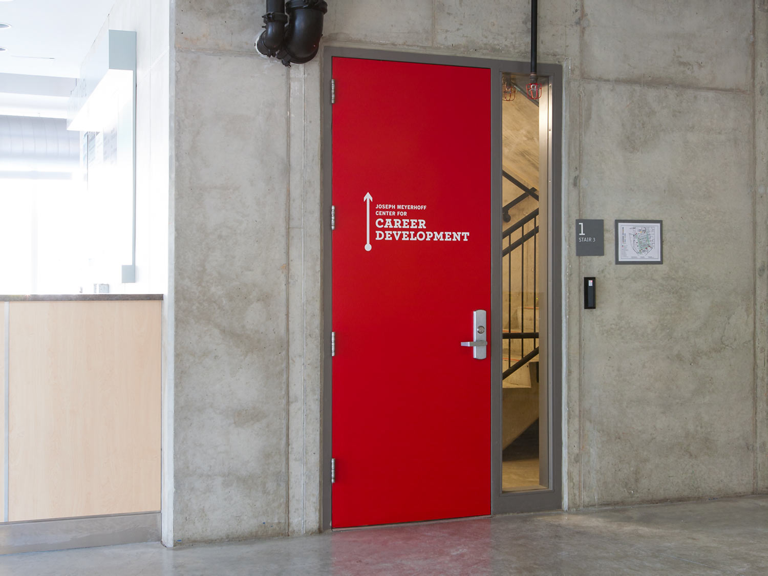
Visitors often had trouble finding the Center, so we made the door impossible to miss. We enlivened the drab stairwell with a big, bright supergraphics that lead visitors up to the Career Center. Each oversized dot contains career advice collected from MICA students and alumni.
The year our graphics were installed, drop-in appointments more than doubled. 86% more alumni visited the Center and 95% of seniors were engaged in some way.

Laying a foundation
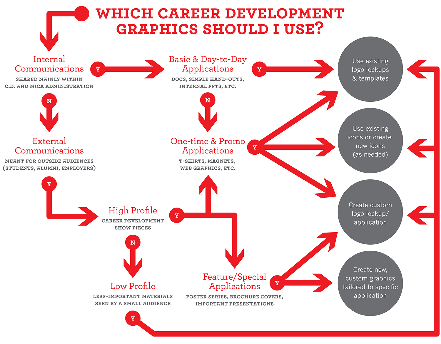
We knew most of the Center’s materials would be made in-house by design students so we created this Art Direction flow chart to accompany the graphic elements package. It’s a useful tool that has helped keep the look consistent even as designers change.


We established a distinct look and many templates to show how to use this kit of parts in future applications.

Examples of how MICA’s student designers stayed true to the identity while expanding its visual style.

“Working with Post Typography was one of the best decisions our team has made. We went from having no consistent identity on campus, to having a brand that has lasted for years.”
— Megan Miller, Director of Career Development, MICA
See more of our higher education portfolio
The New School Recruitment Presentation
MICA Summer Travel Publication


