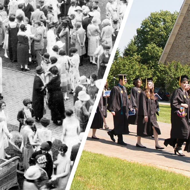
An institutional magazine that doesn’t feel like one.
Goucher College has always been a leader. Founded as a revolutionary women’s school, Goucher is now one of the country’s top 10 most innovative liberal arts colleges. Goucher’s alumni magazine needed a forward-looking redesign to engage a new generation of alumni readers.
Prestigious Past, Promising Future
Established in Baltimore in 1885, the school thrived as a progressive women’s college for over 100 years. Now co-ed, Goucher continues to evolve. The school emphasizes study abroad, activism, and self-directed learning, attracting curious and compassionate thinkers.
Goucher Magazine is a crucial touchpoint for maintaining alumni relationships.
Researching what works and what doesn’t
After analyzing Goucher’s old design along with dozens of other alumni publications, we noticed distinct trends—drab color palettes and slick paper stocks left many magazines feeling boring and institutional, while cluttered layouts, forgettable photos, and inelegant typography discouraged reading.
Award of Excellence Winner: Best Redesign
University & College Designers Association
Eye-catching covers
The covers are perhaps the most unexpected part of the magazine. Colorful illustration and bold graphics catch readers’ eyes and differentiate the magazine.
Our assertive art direction plays a key role in creating dynamic covers and engaging feature designs.
Letting type be the hero
Goucher alums include many distinguished authors, and we wanted the new design to honor language’s central role at the school. After considering hundreds of type families, we chose the beautiful serif typeface Farnham for body and headline text. Full of character, Farnham feels warm, structural, and scholarly without being prudish—a great match for Goucher College. The custom nameplate is also based on this typeface.
Rotating Palette
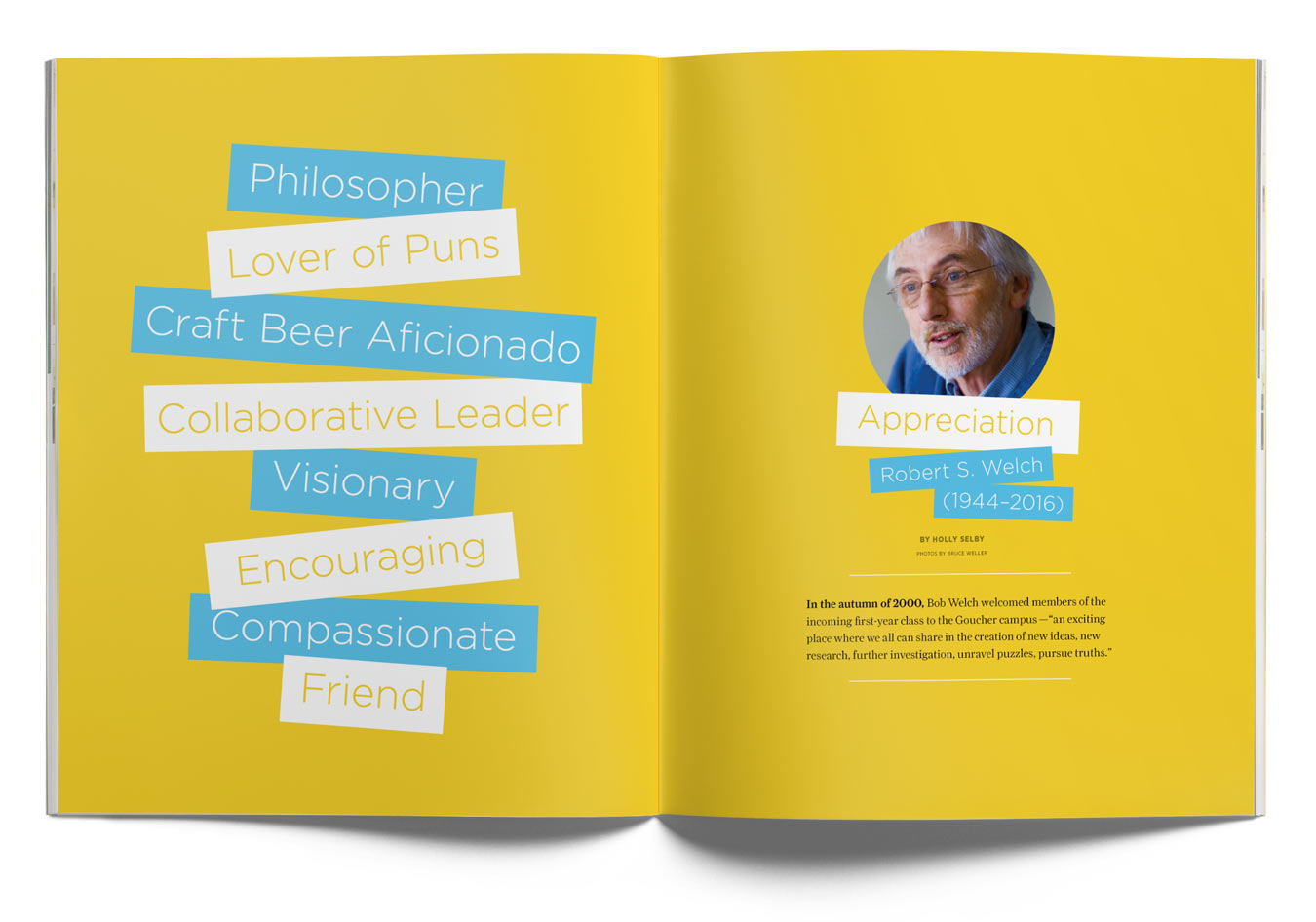
Every issue begins with a familiar format, but is made new with rotating color palettes and dynamic layouts. The magazine is printed on a heavy uncoated paper that imparts a tactile, literary feel.
Dynamic, open layouts
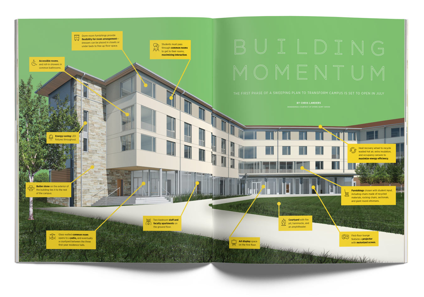
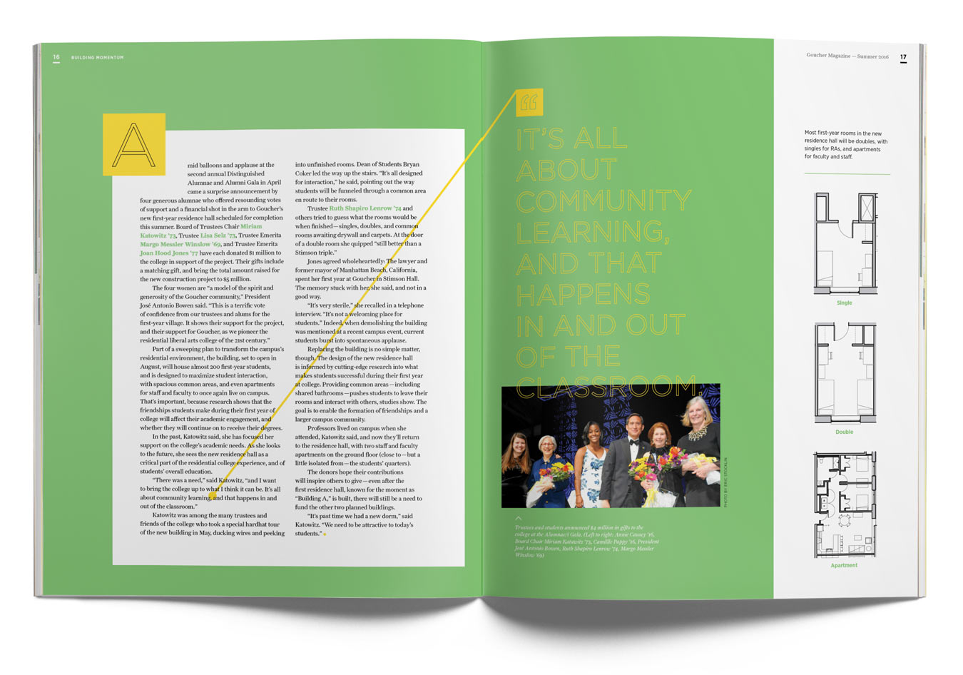
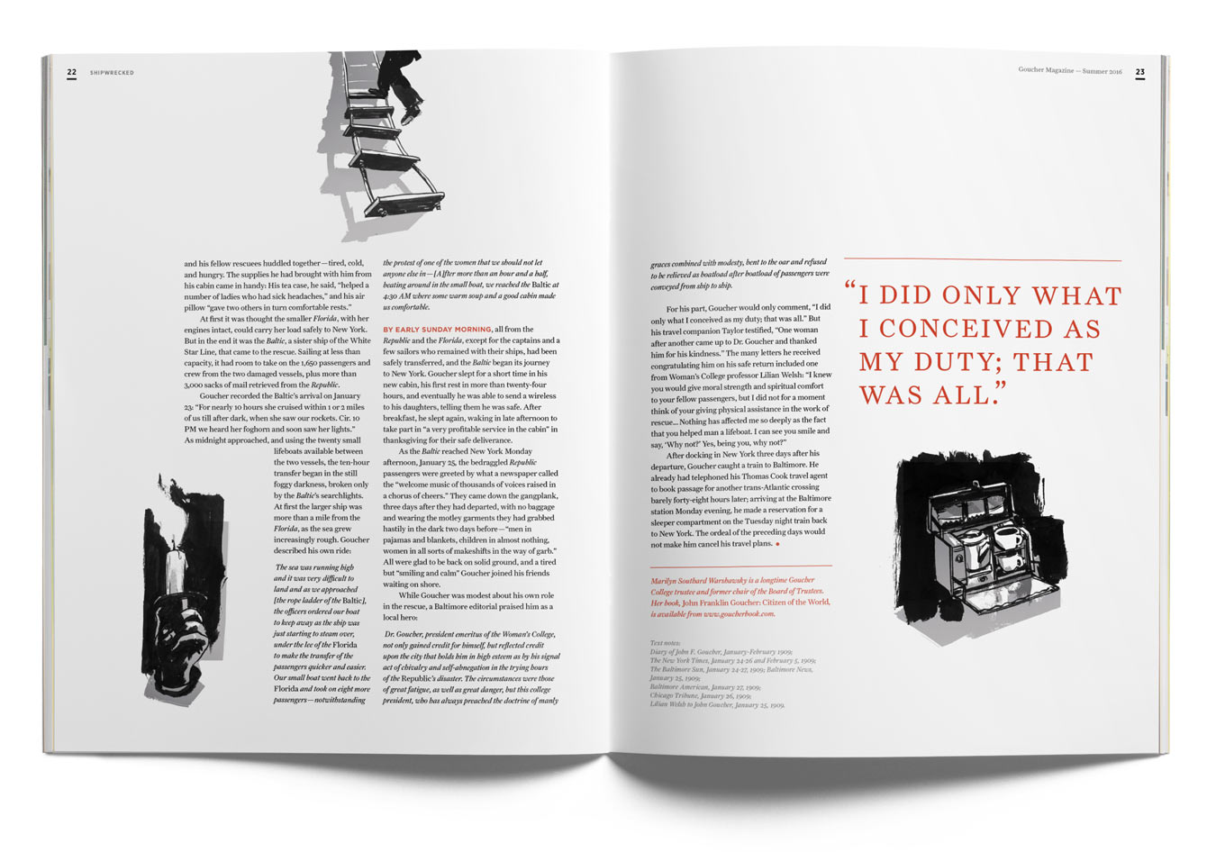
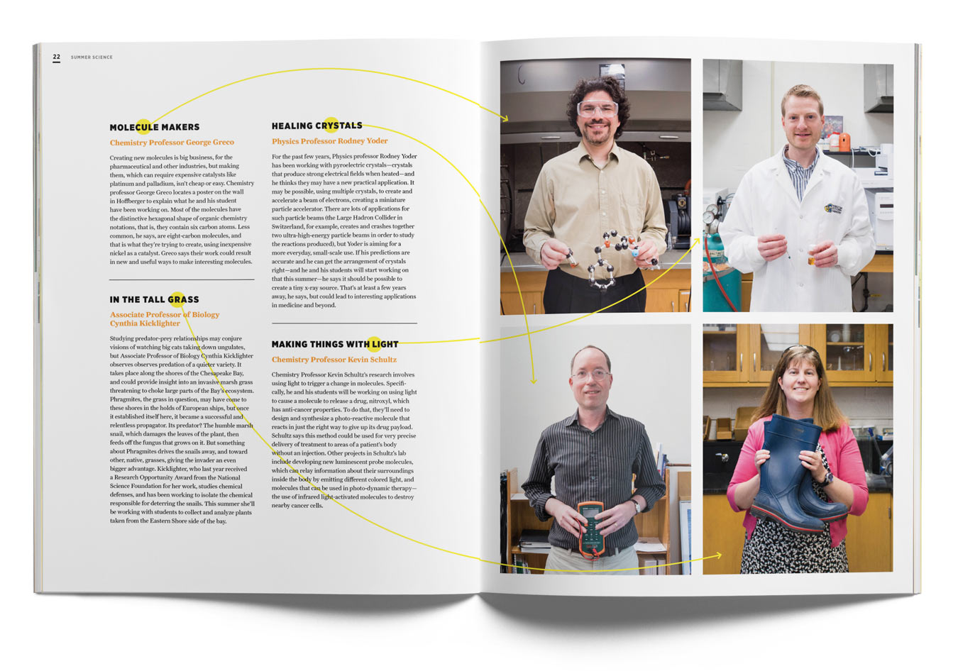
Unique page layouts and careful pacing elevates the reading experience, bringing focus to individual articles. Plentiful white space welcomes the reader, while pull quotes and call-outs help get across key ideas at a glance. Additionally, the magazine’s confident design framework elevates even amateur photos submitted by alumni.
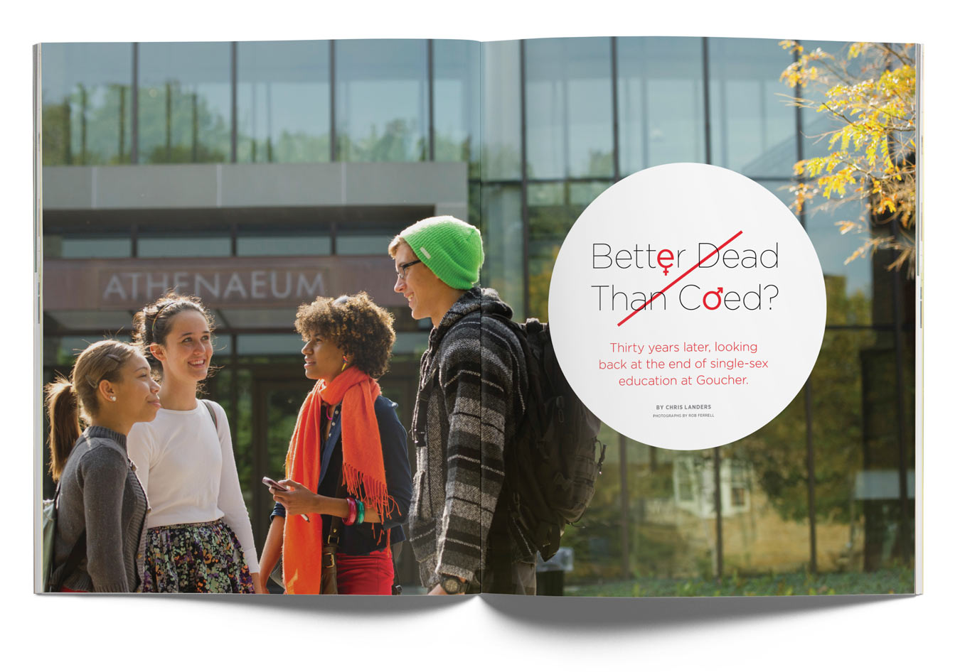
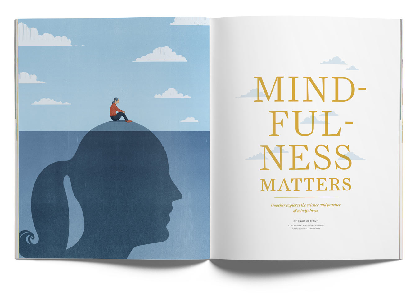
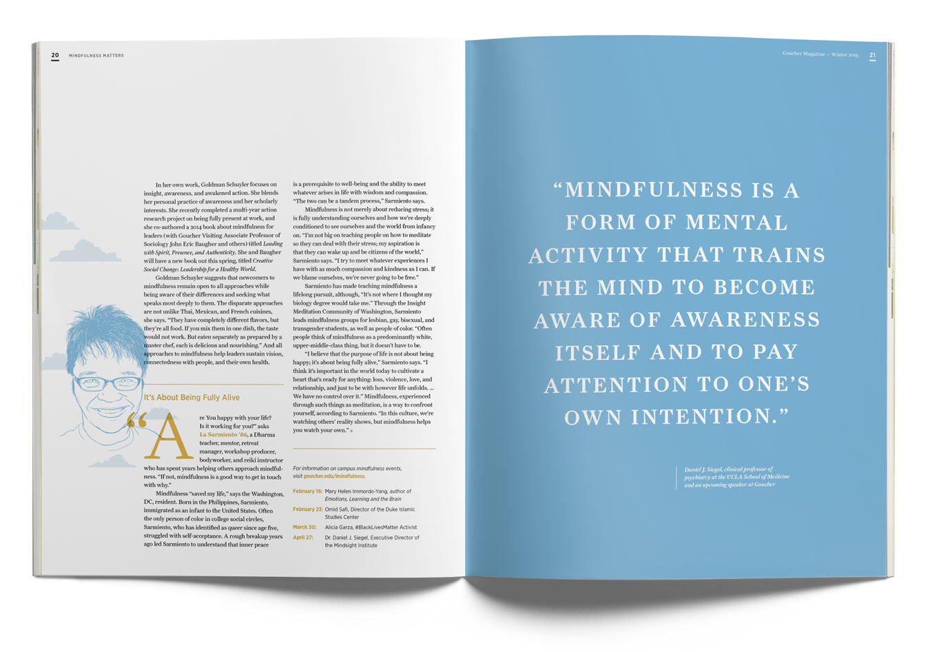
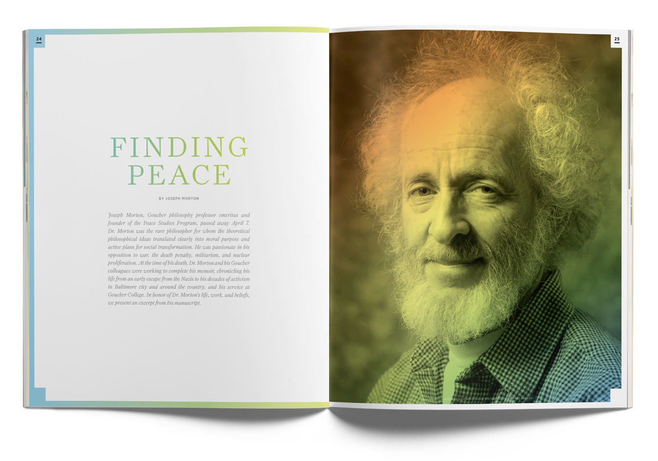
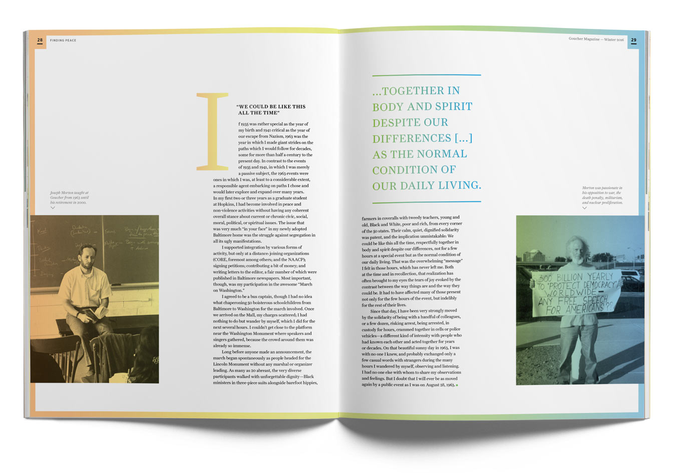
Expressive feature design
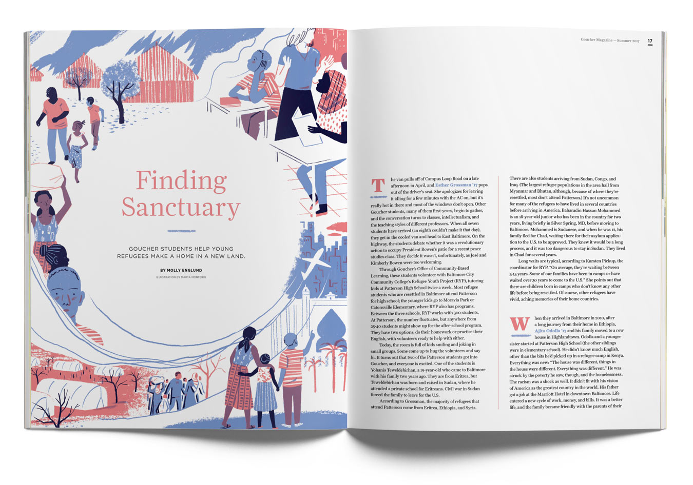
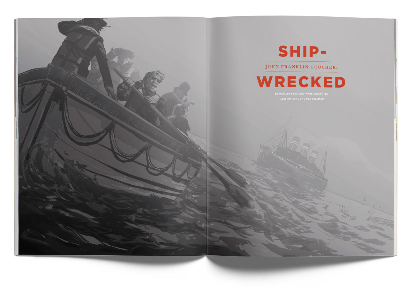
Each feature story has a singular design that pairs evocative imagery with great writing and typography. We designed the first new issues of the magazine, working with Goucher’s staff photographer for specific photos as well as some of the world’s top illustrators to communicate ideas that photos can’t express.
Reading about your friends doesn’t have to be monotonous
In typically-cramped college magazines alumni news looks about as fun to read as the dictionary. We improved the type and readability of Goucher’s Class Notes section, while enlivening it with small alumni profiles and contributed photography.
“Our alumnae and alumni have been enthusiastic about the new design. Without the new look Post Typography came up with, I don’t think it would have gone as smoothly, and they’ve been great partners.”
— Chris Landers, Editor
See more of our higher education portfolio
MICA Career Development Graphic Identity

